competitor analysis
After clearly defining the problem, I began a competitor analysis focused on several key areas. The goal was to deeply understand successful design patterns and operational strategies in the market and identify ways to improve our own product:
Effective communication of promotions
I analyzed how competitors use clear visuals and concise messages to highlight promotions. By making offers easy to find and understand, they increase user engagement and conversions. Simplifying promotional content helps users take action more effectively.
Hierarchy structuring
I analyzed how different platforms organize content and information, using clear hierarchical structures to help users find what they need quickly and improve overall navigation efficiency.
How to improve user retention
I explored the retention strategies competitors use, including point systems, reward mechanisms, and personalized notifications to increase user engagement and return rates.
Recognition
I studied how competitors strengthen brand recognition through consistent design elements and clear brand messaging to help users better remember and identify the brand.
Navigation
I focused on how competitors' navigation systems allow users to move smoothly between pages, providing a seamless user experience.
competitor analysis
After clearly defining the problem, I began a competitor analysis focused on several key areas. The goal was to deeply understand successful design patterns and operational strategies in the market and identify ways to improve our own product:
To boost competitiveness, revamped points system and homepage
To boost competitiveness, revamped points system and homepage

Food Delivery Platform
Food Delivery Platform
All Eat together Asia cuisine
All Eat together Asia cuisine
My Role
My Role
Product Designer - Research, Interaction Design, UIUX Design, Prototyping
Product Designer - Research, Interaction Design, UIUX Design, Prototyping
Product Designer - Research, Interaction Design, UIUX Design, Prototyping
Timeline & Stage
Timeline & Stage
May 2024 - July2024
May 2024 - July2024
May 2024 - July2024
Effective communication of promotions
I analyzed how competitors use clear visuals and concise messages to highlight promotions. By making offers easy to find and understand, they increase user engagement and conversions. Simplifying promotional content helps users take action more effectively.
Hierarchy structuring
I analyzed how different platforms organize content and information, using clear hierarchical structures to help users find what they need quickly and improve overall navigation efficiency.
How to improve user retention
I explored the retention strategies competitors use, including point systems, reward mechanisms, and personalized notifications to increase user engagement and return rates.
Recognition
I studied how competitors strengthen brand recognition through consistent design elements and clear brand messaging to help users better remember and identify the brand.
Navigation
I focused on how competitors' navigation systems allow users to move smoothly between pages, providing a seamless user experience.
competitor analysis
After clearly defining the problem, I began a competitor analysis focused on several key areas. The goal was to deeply understand successful design patterns and operational strategies in the market and identify ways to improve our own product:
Let’s start with the results
Let’s start with the results
£50k+
£50k+
£50k+
Revenues generated from the membership program
Revenues generated from the membership program
Revenues generated from the membership program
+10%
+10%
+10%
Increase in new memberships
Increase in new memberships
Increase in new memberships
5%
5%
5%
Boost in user engagement (DAU/MAU)
Boost in user engagement (DAU/MAU)
Boost in user engagement (DAU/MAU)
Project Background
The purpose of the All Eat App is to provide users with a simple and efficient membership points system that enhances user engagement and loyalty. Through this system, users can easily earn and use points, making the platform more appealing and competitive.
The purpose of the All Eat App is to provide users with a simple and efficient membership points system that enhances user engagement and loyalty. Through this system, users can easily earn and use points, making the platform more appealing and competitive.
Problem and Needs
The previous membership points system was too complicated, and many users didn’t understand how to earn or use points. This led to low usage of the points system and negatively affected the overall user experience. It not only decreased user engagement but also reduced potential transaction opportunities. Therefore, we decided to redesign the points system to improve the user experience, making it easier to understand and encouraging more interaction.
The previous membership points system was too complicated, and many users didn’t understand how to earn or use points. This led to low usage of the points system and negatively affected the overall user experience. It not only decreased user engagement but also reduced potential transaction opportunities. Therefore, we decided to redesign the points system to improve the user experience, making it easier to understand and encouraging more interaction.
The previous membership points system was too complicated, and many users didn’t understand how to earn or use points. This led to low usage of the points system and negatively affected the overall user experience. It not only decreased user engagement but also reduced potential transaction opportunities. Therefore, we decided to redesign the points system to improve the user experience, making it easier to understand and encouraging more interaction.
Findings:
Users struggle with using points, checking balances, and understanding point terms. This shows the need for clearer communication, design, and easier access to information to improve the user experience.

Findings:
Users struggle with using points, checking balances, and understanding point terms. This shows the need for clearer communication, design, and easier access to information to improve the user experience.
Users struggle with using points, checking balances, and understanding point terms. This shows the need for clearer communication, design, and easier access to information to improve the user experience.
competitor analysis
After clearly defining the problem, I began a competitor analysis focused on several key areas. The goal was to deeply understand successful design patterns and operational strategies in the market and identify ways to improve our own product:
Effective communication of promotions
I analyzed how competitors use clear visuals and concise messages to highlight promotions. By making offers easy to find and understand, they increase user engagement and conversions. Simplifying promotional content helps users take action more effectively.
Hierarchy structuring
I analyzed how different platforms organize content and information, using clear hierarchical structures to help users find what they need quickly and improve overall navigation efficiency.
How to improve user retention
I explored the retention strategies competitors use, including point systems, reward mechanisms, and personalized notifications to increase user engagement and return rates.
Recognition
I studied how competitors strengthen brand recognition through consistent design elements and clear brand messaging to help users better remember and identify the brand.
Navigation
I focused on how competitors' navigation systems allow users to move smoothly between pages, providing a seamless user experience.
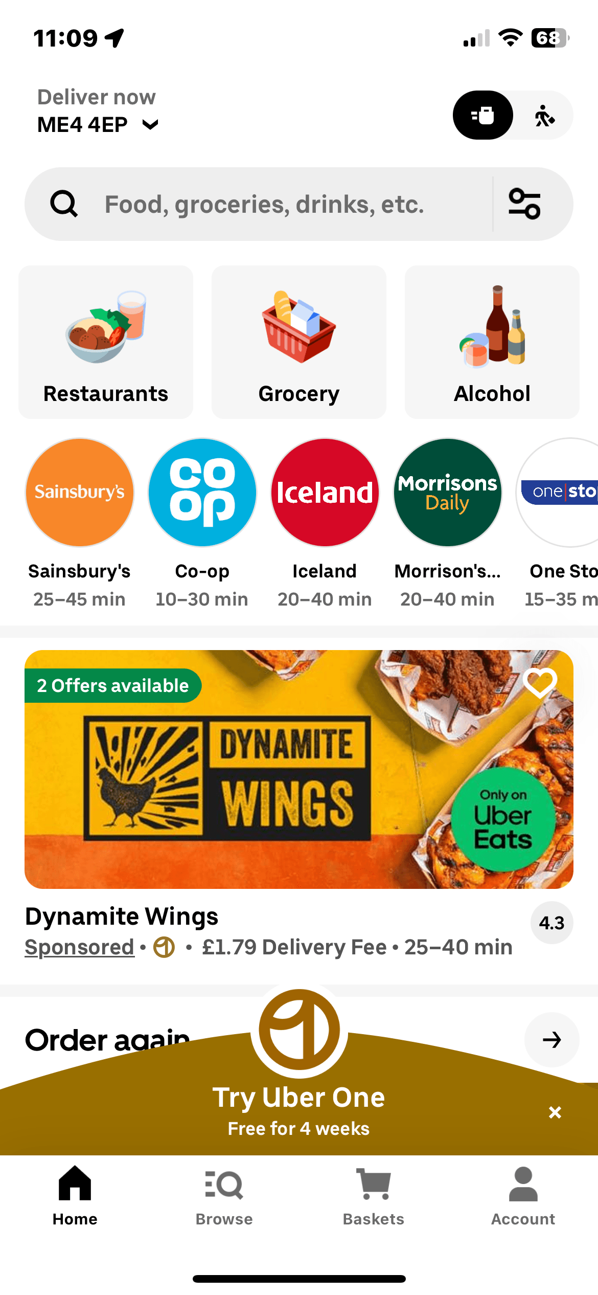
UberEat
Gray and white background + black highlights = clean and clear.
Food categories use icons = simple and straightforward.
Weakness: The overall hierarchy is somewhat complex (too many configurations with corner radius).
Promotions use a [circular swipe up] feature = increases engagement and improves navigation.
Just Eat
Black background with orange highlights = creates strong distinction from other delivery platforms, increasing user memorability.
Food categories use colored backgrounds = improves recall.
The layout is simple and clear, with the size contrast being very attention-grabbing.
Deliveroo
Gray and white background + green highlights = clean and clear.
Food categories without background = simple and easy to understand.
Weakness: Their promotion method is just a bunch of text, which users are too lazy to read. It can be used as a reference but not recommended.
The overall hierarchy is clean and organized, but lacks distinctiveness.


Hungrypanda
White background, and they only use colorless labels because their icons are already very colorful.
Food categories are displayed using icons.
The layout doesn’t use too many frames, except for "categories," which uses a frame. This is a good approach.
The promotion section pops up with a notification upon login, and the voucher is continuously displayed in the bottom right corner.


Results and Impact
Interface upgrade
To verify the effectiveness of our interface improvements, I conducted user testing. The previous interface had issues with visual clutter and inconsistent layout, so I wanted to see if the new design could improve the user experience and enhance the platform’s usability.
To verify the effectiveness of our interface improvements, I conducted user testing. The previous interface had issues with visual clutter and inconsistent layout, so I wanted to see if the new design could improve the user experience and enhance the platform’s usability.
Testing method
Testing method
Testing method
I organized a street campaign, distributing flyers and recruiting 30 users to participate in the test. They scanned the QR code on the flyer to download our test version and followed task instructions to navigate through the new interface. I recorded their actions, including the time it took to select a target, the error rate, and task completion efficiency.
I organized a street campaign, distributing flyers and recruiting 30 users to participate in the test. They scanned the QR code on the flyer to download our test version and followed task instructions to navigate through the new interface. I recorded their actions, including the time it took to select a target, the error rate, and task completion efficiency.

Before

After
After
After


test results
test results
test results
Based on the test results, I made key changes to the interface. I moved the poster to a new position for better visibility, enlarged the food category icons to help users find options quickly, and redesigned the special offer section to make promotions more noticeable.
Based on the test results, I made key changes to the interface. I moved the poster to a new position for better visibility, enlarged the food category icons to help users find options quickly, and redesigned the special offer section to make promotions more noticeable.
These changes improved user engagement. The task completion rate increased, users returned to the platform more often, and errors were reduced, making the interface easier to use overall.
These changes improved user engagement. The task completion rate increased, users returned to the platform more often, and errors were reduced, making the interface easier to use overall.
UberEat
Gray and white background + black highlights = clean and clear.
Food categories use icons = simple and straightforward.
Weakness: The overall hierarchy is somewhat complex (too many configurations with corner radius).
Promotions use a [circular swipe up] feature = increases engagement and improves navigation.
Just Eat
Black background with orange highlights = creates strong distinction from other delivery platforms, increasing user memorability.
Food categories use colored backgrounds = improves recall.
The layout is simple and clear, with the size contrast being very attention-grabbing.
Deliveroo
Gray and white background + green highlights = clean and clear.
Food categories without background = simple and easy to understand.
Weakness: Their promotion method is just a bunch of text, which users are too lazy to read. It can be used as a reference but not recommended.
The overall hierarchy is clean and organized, but lacks distinctiveness.
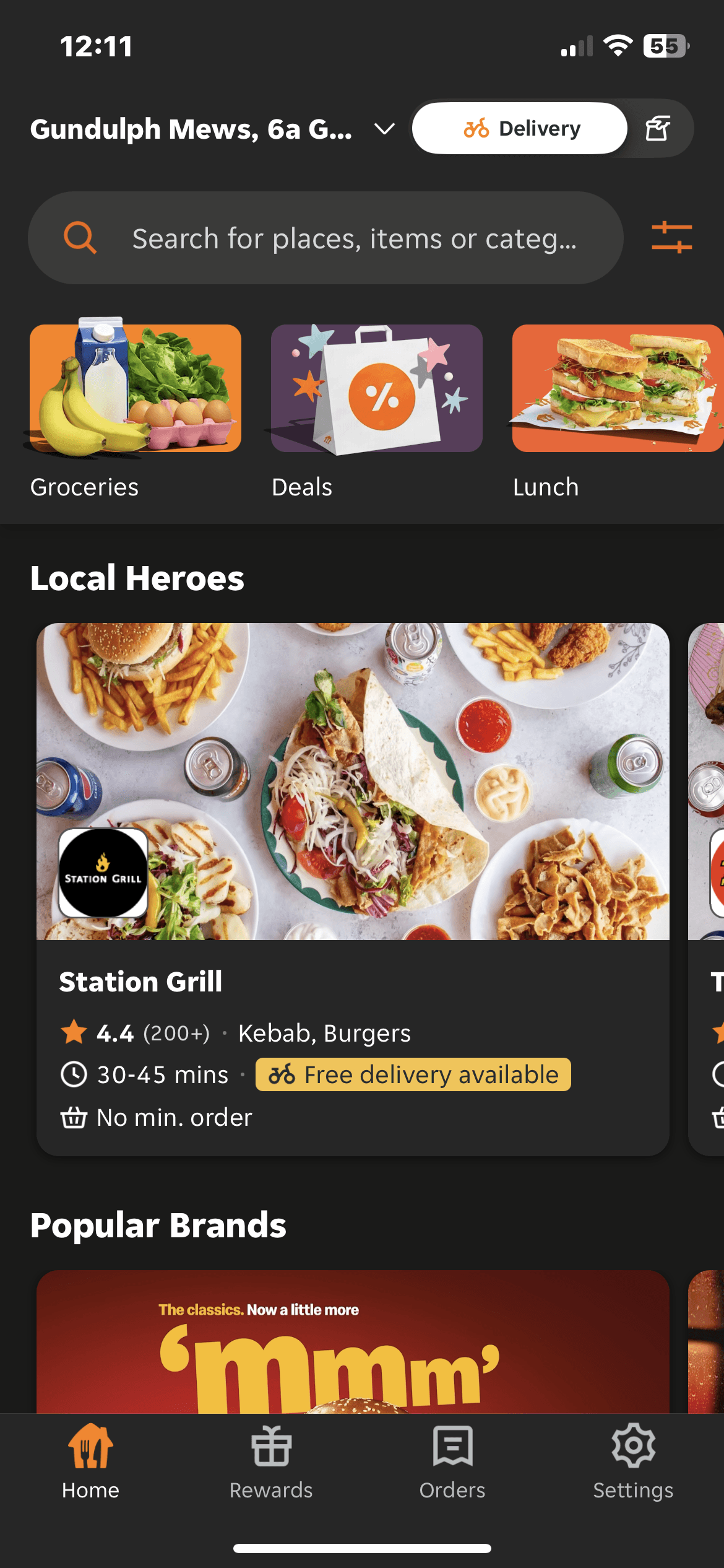
Hungrypanda
White background, and they only use colorless labels because their icons are already very colorful.
Food categories are displayed using icons.
The layout doesn’t use too many frames, except for "categories," which uses a frame. This is a good approach.
The promotion section pops up with a notification upon login, and the voucher is continuously displayed in the bottom right corner.
Improve Adoption rate
Improve Adoption rate
22.81%
22.81%
42%
Task Completion Time :
Users were able to quickly find their target upon logging into the interface.
By reusing the layout to reduce background interference and increasing font-weight contrast, the adoption rate increased from 22.81% to 42%.
* The benchmark for good feature adoption rates in B2C SaaS is typically between 35-45%.
Before style
Before style
Before style

After style
After style
After style

Increase Clickability
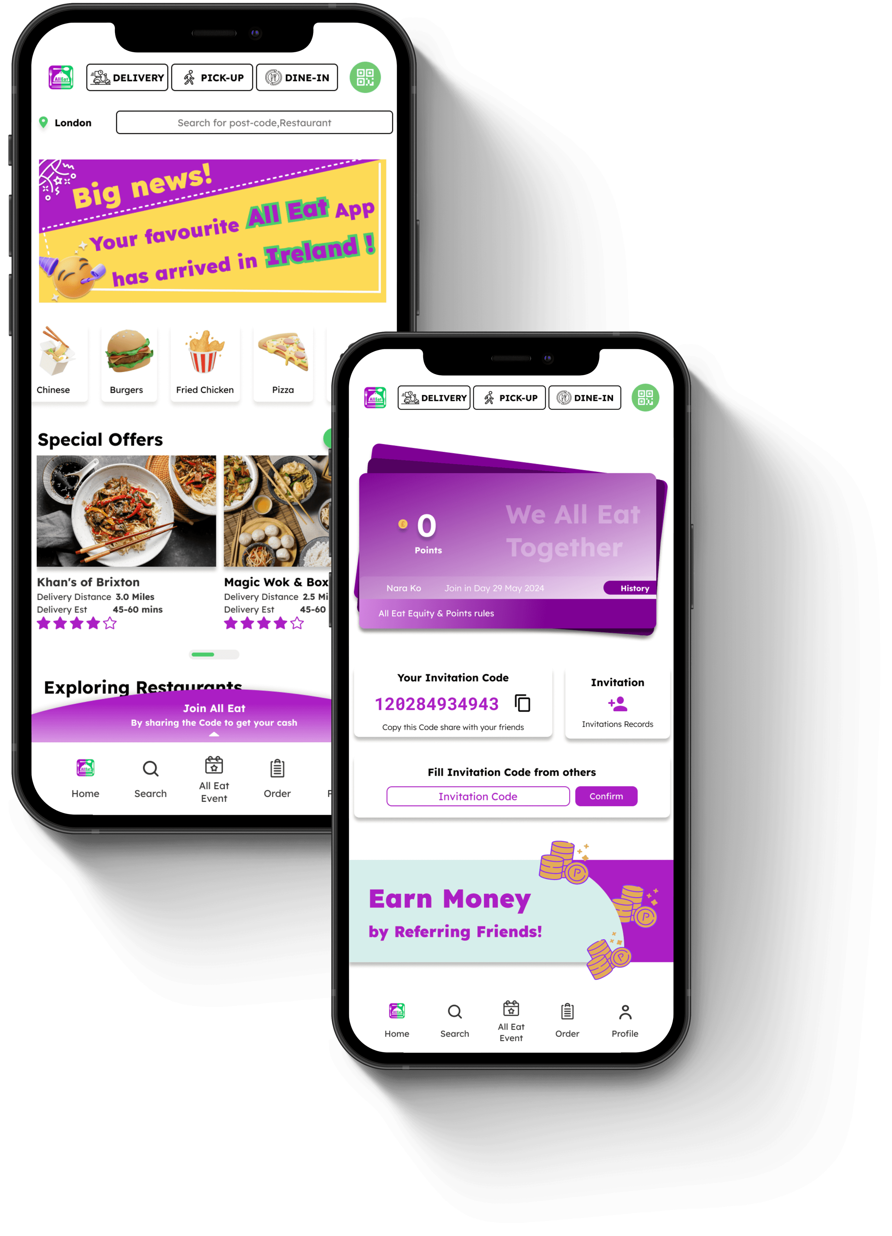
After conducting analysis and research, we decided to adopt a method similar to UberEats by modifying the membership points entry.
The membership entry was moved to the bottom of the page, as research showed that users are more likely to interact with elements after scrolling to the bottom. This change was made to increase clickability and align with user behavior.
Before style
Before style
Before style

After style
After style
After style


Click-Through Rate (CTR):
Click-Through Rate (CTR):
Definition: We use this method to test the click-through rate before and after placing the membership entry at the bottom of the page to see if there is an increase.
Definition: We use this method to test the click-through rate before and after placing the membership entry at the bottom of the page to see if there is an increase.
Before: 15%
Before: 15%
After: 30%
After: 30%
Analysis: If CTR increases from 15% to 30%, it shows that placing the membership entry at the bottom improves clickability
Analysis: If CTR increases from 15% to 30%, it shows that placing the membership entry at the bottom improves clickability
Analysis: If CTR increases from 15% to 30%, it shows that placing the membership entry at the bottom improves clickability
Scroll Depth Analysis:
Scroll Depth Analysis:
Definition: This measures the percentage of users who scroll to the bottom of the page and whether they click the membership entry at the bottom.
Definition: This measures the percentage of users who scroll to the bottom of the page and whether they click the membership entry at the bottom.
Users who scrolled to the bottom: 60%
Users who scrolled to the bottom: 60%
Users who clicked: 40%
Users who clicked: 40%
Analysis: This data shows how many users interact after scrolling to the bottom, proving if the bottom placement aligns with user behavior
Analysis: This data shows how many users interact after scrolling to the bottom, proving if the bottom placement aligns with user behavior
Enhancing membership point's User Engagement
After conducting thorough user research and testing, we implemented several key changes to improve the user experience of the membership points system. These adjustments were made to simplify navigation, improve visual hierarchy, and streamline user interactions.
Problem:
The text explaining the membership points system is too crowded, making it hard for users to understand.
The pop-up window after clicking is not well-organized, so users cannot fully understand how to use the points.
Before style
Before style
Before style

After style
After style
After style


Solution
Solution
Improve Clickability
The member entrance is placed at the bottom of the page to enhance clickability, aligning with user behavior where they tend to interact with elements after scrolling to the bottom."
The member entrance is placed at the bottom of the page to enhance clickability, aligning with user behavior where they tend to interact with elements after scrolling to the bottom."
Improve Visual Hierarchy, Affordance
When users enter the membership homepage, they see a virtual credit card showing their points. This uses visual hierarchy to direct their attention to their accumulated points, increasing engagement.
When users enter the membership homepage, they see a virtual credit card showing their points. This uses visual hierarchy to direct their attention to their accumulated points, increasing engagement.
Change User Flow, Microcopy
By using user flow and microcopy, a step-by-step guide with visuals helps users understand how to earn points and the benefits, simplifying the process and reducing confusion.
By using user flow and microcopy, a step-by-step guide with visuals helps users understand how to earn points and the benefits, simplifying the process and reducing confusion.
User feedback
From our backend order system, we can clearly see a significant increase in users redeeming points for food.
Initiated Key User Experience Enhancements
Complete redesign of the membership points interface, focusing on boosting user engagement and enhancing market competitiveness.
Complete redesign of the membership points interface, focusing on boosting user engagement and enhancing market competitiveness.
Pre-Update Issues:
.Low user awareness of membership benefits, indicating gaps in communication and onboarding processes.
.Minimal user engagement with available discounts and rewards, highlighting friction in the user journey and a lack of perceived value.
.Low user awareness of membership benefits, indicating gaps in communication and onboarding processes.
.Minimal user engagement with available discounts and rewards, highlighting friction in the user journey and a lack of perceived value.
Post-Update Improvements:
.5% increase in user engagement with the membership system, demonstrating improvements in user flow and engagement metrics.
.Significant increase in the utilization rate of discounts and rewards, reflecting improved discoverability and affordance.
.Enhanced user satisfaction and retention through optimized access to rewards, resulting in higher user loyalty and conversion rates.
