To boost competitiveness, revamped its points system and homepage
To boost competitiveness, revamped its points system and homepage
To boost competitiveness, revamped its points system and homepage

Food Delivery Platform
Food Delivery Platform
All Eat together Asia cuisine
All Eat together Asia cuisine
My Role
My Role
My Role
Product Designer - Research, Interaction Design, UIUX Design, Prototyping
Product Designer - Research, Interaction Design, UIUX Design, Prototyping
Product Designer - Research, Interaction Design, UIUX Design, Prototyping
Timeline & Stage
Timeline & Stage
Timeline & Stage
May 2024 - July2024
May 2024 - July2024
May 2024 - July2024
Let’s start with the results
Let’s start with the results
Let’s start with the results
£50k+
£50k+
£50k+
Revenues generated from the membership program
Revenues generated from the membership program
Revenues generated from the membership program
+10%
+10%
+10%
Increase in new memberships
Increase in new memberships
Increase in new memberships
5%
5%
5%
Boost in user engagement (DAU/MAU)
Boost in user engagement (DAU/MAU)
Boost in user engagement (DAU/MAU)
Addressing Key Pain Points
Addressing Key Pain Points
Addressing Key Pain Points
Target Audience
Target Audience
Target Audience
Increase user engagement and time spent by optimizing page design and adjusting the points entry for longer first-time visits
Increase user engagement and time spent by optimizing page design and adjusting the points entry for longer first-time visits
Increase user engagement and time spent by optimizing page design and adjusting the points entry for longer first-time visits
Goals
Goals
Goals
.Fix issues from the previous version.
.Improve design consistency for better user experience.
.Make the membership points system easier to understand and use.
.Fix issues from the previous version.
.Improve design consistency for better user experience.
.Make the membership points system easier to understand and use.
.Fix issues from the previous version.
.Improve design consistency for better user experience.
.Make the membership points system easier to understand and use.
PainPoints
PainPoints
PainPoints
.Users struggle to make quick decisions.
.Testing needs to be released to get real data.
.Limited collaboration from other teams.
.Users struggle to make quick decisions.
.Testing needs to be released to get real data.
.Limited collaboration from other teams.
.Users struggle to make quick decisions.
.Testing needs to be released to get real data.
.Limited collaboration from other teams.
challenge
challenge
How do we optimize the interface to really increase user retention and engagement?
How do we optimize the interface to really increase user retention and engagement?
How do we optimize the interface to really increase user retention and engagement?
My Approach - How do I work as a product designer with an agile team?
My Approach - How do I work as a product designer with an agile team?
Let’s take the “Reasoning Label” design as example...
Let’s take the “Reasoning Label” design as example...
Let’s take the “Reasoning Label” design as example...
Define Product Goals and Understanding
First, clarify the boss’s needs and user expectations.
Research and Design
Create research directions (such as competitor analysis) and identify reference methods
Rapid Iteration
Each iteration focuses on developing and testing a portion of the features, quickly delivering usable product increments.
User Feedback
Conduct user testing in each iteration, gather feedback, and improve designs and features.
Continuous Optimization
Continuously optimize designs and features based on feedback and testing results until user needs are met and the product is ready for launch.
Define Product Goals and Understanding
Define Product Goals and Understanding
By monitoring customer feedback and interacting with users, we have gathered common user behaviors and provided specific explanations on how to use the points system based on customer needs.
By monitoring customer feedback and interacting with users, we have gathered common user behaviors and provided specific explanations on how to use the points system based on customer needs.
By monitoring customer feedback and interacting with users, we have gathered common user behaviors and provided specific explanations on how to use the points system based on customer needs.

Findings:
Users struggle with using points, checking balances, and understanding point terms. This shows the need for clearer communication, design, and easier access to information to improve the user experience.
Findings:
Findings:
Users struggle with using points, checking balances, and understanding point terms. This shows the need for clearer communication, design, and easier access to information to improve the user experience.
Users struggle with using points, checking balances, and understanding point terms. This shows the need for clearer communication, design, and easier access to information to improve the user experience.
Research and Design
I researched how other competitors worked with discount codes and membership portals. What can I refer to? and then discuss these analyzes with my stakeholders
Research: competitor analysis
When conducting competitor research, I use these key metrics to analyze and evaluate the strategies of other competitors.
Effective communication of promotions
Hierarchy structuring
How to improve user retention
Recognition
Navigation
UberEat
Gray and white background + black highlights = clean and clear.
Food categories use icons = simple and straightforward.
Weakness: The overall hierarchy is somewhat complex (too many configurations with corner radius).
Promotions use a [circular swipe up] feature = increases engagement and improves navigation.
Just Eat
Black background with orange highlights = creates strong distinction from other delivery platforms, increasing user memorability.
Food categories use colored backgrounds = improves recall.
The layout is simple and clear, with the size contrast being very attention-grabbing.
Deliveroo
Gray and white background + green highlights = clean and clear.
Food categories without background = simple and easy to understand.
Weakness: Their promotion method is just a bunch of text, which users are too lazy to read. It can be used as a reference but not recommended.
The overall hierarchy is clean and organized, but lacks distinctiveness.


Hungrypanda
White background, and they only use colorless labels because their icons are already very colorful.
Food categories are displayed using icons.
The layout doesn’t use too many frames, except for "categories," which uses a frame. This is a good approach.
The promotion section pops up with a notification upon login, and the voucher is continuously displayed in the bottom right corner.


Deliveroo
Gray and white background + green highlights = clean and clear.
Food categories without background = simple and easy to understand.
Weakness: Their promotion method is just a bunch of text, which users are too lazy to read. It can be used as a reference but not recommended.
The overall hierarchy is clean and organized, but lacks distinctiveness.
Hungrypanda
White background, and they only use colorless labels because their icons are already very colorful.
Food categories are displayed using icons.
The layout doesn’t use too many frames, except for "categories," which uses a frame. This is a good approach.
The promotion section pops up with a notification upon login, and the voucher is continuously displayed in the bottom right corner.
Rapid iteration
Rapid iteration
Therefore, the optimization plan will be divided into two parts
Therefore, the optimization plan will be divided into two parts
1.Interface upgrade
2. Redesign of membership points system,
1.Interface upgrade
2. Redesign of membership points system,
1.Interface upgrade
2. Redesign of membership points system,
1.Interface upgrade
1.Interface upgrade
Problem:
Problem:
Problem:
The previous version lacked appeal
The previous version lacked appeal
Visual confusion:
Visual confusion:
Visual confusion:
Too many colors and text make the interface hard to focus on key information.
Too many colors and text make the interface hard to focus on key information.
Too many colors and text make the interface hard to focus on key information.
Inconsistent Layout:
Inconsistent Layout:
Inconsistent Layout:
Different fonts and sizes create a disjointed look.
Different fonts and sizes create a disjointed look.
Different fonts and sizes create a disjointed look.
Upgrade the interface to a more intuitive design based on previous research.
Upgrade the interface to a more intuitive design based on previous research.
Before style
Before style
Before style

Using UserTesting
Using UserTesting
Using UserTesting
We conducted a street campaign by distributing flyers and recruiting 30 users. They were asked to scan the QR code on the flyer and download our test version.
From this, we reached the following conclusions:
We conducted a street campaign by distributing flyers and recruiting 30 users. They were asked to scan the QR code on the flyer and download our test version.
From this, we reached the following conclusions:
We conducted a street campaign by distributing flyers and recruiting 30 users. They were asked to scan the QR code on the flyer and download our test version.
From this, we reached the following conclusions:
Task Completion Time :
Users were able to quickly find their target upon logging into the interface.

After style
After style
After style

1.Interface upgrade
1.Interface upgrade
Problem:
Problem:
Problem:
Low space utilization. The content of the restaurant introduction is crowded together and difficult to read
Low space utilization. The content of the restaurant introduction is crowded together and difficult to read
Inefficient Use of Space
Inefficient Use of Space
Inefficient Use of Space
Too much empty space leads to wasted screen space
Too much empty space leads to wasted screen space
Too much empty space leads to wasted screen space
Layout hierarchy, restructured
Layout hierarchy, restructured
Before style
Before style
Before style

Improve Adoption rate
Improve Adoption rate
Improve Adoption rate
22.81%
22.81%
22.81%
42%
42%
Task Completion Time :
Users were able to quickly find their target upon logging into the interface.
By reusing the layout to reduce background interference and increasing font-weight contrast, the adoption rate increased from 22.81% to 42%.
By reusing the layout to reduce background interference and increasing font-weight contrast, the adoption rate increased from 22.81% to 42%.
By reusing the layout to reduce background interference and increasing font-weight contrast, the adoption rate increased from 22.81% to 42%.
* The benchmark for good feature adoption rates in B2C SaaS is typically between 35-45%.
* The benchmark for good feature adoption rates in B2C SaaS is typically between 35-45%.
* The benchmark for good feature adoption rates in B2C SaaS is typically between 35-45%.
After style
After style
After style

Redesign of membership points system- Design Solutions for Key User Problems
Redesign of membership points system- Design Solutions for Key User Problems
Redesign of membership points system- Design Solutions for Key User Problems
Problem:
Problem:
Problem:
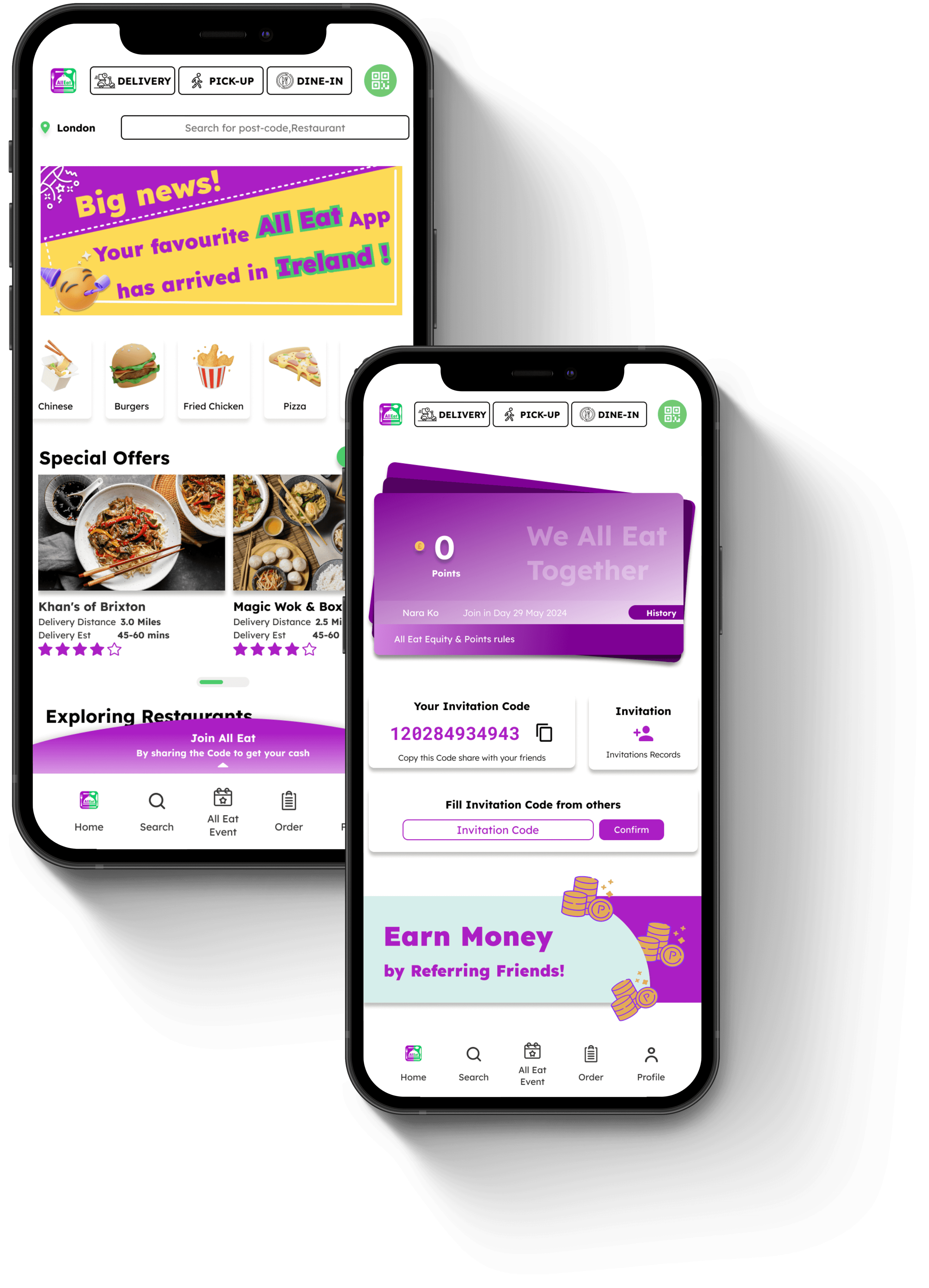
Point system entry was too unobvious to notice
Point system entry was too unobvious to notice
The previous design looked like a poster, leading users to quickly scroll past the homepage and miss the clickable membership points option
The previous design looked like a poster, leading users to quickly scroll past the homepage and miss the clickable membership points option
The previous design looked like a poster, leading users to quickly scroll past the homepage and miss the clickable membership points option
Version optimization
Version optimization
Before style
Before style
Before style
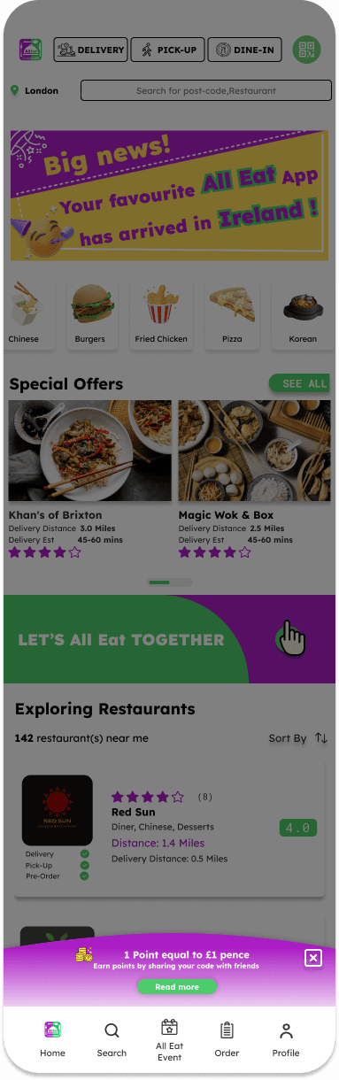
Increase Clickability
After previous analysis and research, we decided to adopt UberEat’s approach to modify the membership entry.
The membership entry is placed at the bottom of the page to enhance clickability, aligning with user behavior where they tend to interact with elements after scrolling to the bottom.
After previous analysis and research, we decided to adopt UberEat’s approach to modify the membership entry.
The membership entry is placed at the bottom of the page to enhance clickability, aligning with user behavior where they tend to interact with elements after scrolling to the bottom.
After previous analysis and research, we decided to adopt UberEat’s approach to modify the membership entry.
The membership entry is placed at the bottom of the page to enhance clickability, aligning with user behavior where they tend to interact with elements after scrolling to the bottom.
Click-Through Rate (CTR):
Definition: We use this method to test the click-through rate before and after placing the membership entry at the bottom of the page to see if there is an increase.
Definition: We use this method to test the click-through rate before and after placing the membership entry at the bottom of the page to see if there is an increase.
Before: 15%
Before: 15%
After: 30%
After: 30%
Analysis: If CTR increases from 15% to 30%, it shows that placing the membership entry at the bottom improves clickability
Analysis: If CTR increases from 15% to 30%, it shows that placing the membership entry at the bottom improves clickability
Analysis: If CTR increases from 15% to 30%, it shows that placing the membership entry at the bottom improves clickability
Scroll Depth Analysis:
Definition: This measures the percentage of users who scroll to the bottom of the page and whether they click the membership entry at the bottom.
Definition: This measures the percentage of users who scroll to the bottom of the page and whether they click the membership entry at the bottom.
Users who scrolled to the bottom: 60%
Users who scrolled to the bottom: 60%
Users who clicked: 40%
Users who clicked: 40%
Analysis: This data shows how many users interact after scrolling to the bottom, proving if the bottom placement aligns with user behavior
Analysis: This data shows how many users interact after scrolling to the bottom, proving if the bottom placement aligns with user behavior
After style
After style
After style

Redesign of membership points system- Design Solutions for Key User Problems
Redesign of membership points system- Design Solutions for Key User Problems
Redesign of membership points system- Design Solutions for Key User Problems
Problem:
Problem:
Problem:
The points explanation text is cluttered together, making it difficult for users to understand
The points explanation text is cluttered together, making it difficult for users to understand
The points explanation text is cluttered together, making it difficult for users to understand
The instructions after clicking are a Pop window. The font has not been arranged and cannot achieve the benefits of real use.
The instructions after clicking are a Pop window. The font has not been arranged and cannot achieve the benefits of real use.
The instructions after clicking are a Pop window. The font has not been arranged and cannot achieve the benefits of real use.
Use images to explain the steps one by one.
Use images to explain the steps one by one.
Before style
Before style
Before style

Improve Clickability
Improve Clickability
The member entrance is placed at the bottom of the page to enhance clickability, aligning with user behavior where they tend to interact with elements after scrolling to the bottom."
The member entrance is placed at the bottom of the page to enhance clickability, aligning with user behavior where they tend to interact with elements after scrolling to the bottom."
Improve Visual Hierarchy, Affordance
Improve Visual Hierarchy, Affordance
When users enter the membership homepage, they see a virtual credit card showing their points. This uses visual hierarchy to direct their attention to their accumulated points, increasing engagement.
When users enter the membership homepage, they see a virtual credit card showing their points. This uses visual hierarchy to direct their attention to their accumulated points, increasing engagement.
Change User Flow, Microcopy
Change User Flow, Microcopy
By using user flow and microcopy, a step-by-step guide with visuals helps users understand how to earn points and the benefits, simplifying the process and reducing confusion.
By using user flow and microcopy, a step-by-step guide with visuals helps users understand how to earn points and the benefits, simplifying the process and reducing confusion.
After style
After style
After style


User Feedback
User Feedback
From our backend order system, we can clearly see a significant increase in users redeeming points for food.
Initiated Key User Experience Enhancements
Initiated Key User Experience Enhancements
Complete redesign of the membership points interface, focusing on boosting user engagement and enhancing market competitiveness.
Complete redesign of the membership points interface, focusing on boosting user engagement and enhancing market competitiveness.
Complete redesign of the membership points interface, focusing on boosting user engagement and enhancing market competitiveness.
Pre-Update Issues:
Pre-Update Issues:
.Low user awareness of membership benefits, indicating gaps in communication and onboarding processes.
.Minimal user engagement with available discounts and rewards, highlighting friction in the user journey and a lack of perceived value.
.Low user awareness of membership benefits, indicating gaps in communication and onboarding processes.
.Minimal user engagement with available discounts and rewards, highlighting friction in the user journey and a lack of perceived value.
.Low user awareness of membership benefits, indicating gaps in communication and onboarding processes.
.Minimal user engagement with available discounts and rewards, highlighting friction in the user journey and a lack of perceived value.
Post-Update Improvements:
Post-Update Improvements:
.5% increase in user engagement with the membership system, demonstrating improvements in user flow and engagement metrics.
.Significant increase in the utilization rate of discounts and rewards, reflecting improved discoverability and affordance.
.Enhanced user satisfaction and retention through optimized access to rewards, resulting in higher user loyalty and conversion rates.

Feedback Note
Feedback Note
Our backend system shows a growing number of users paying with points, with a 30% increase in memberships following the redesign. This boosts our market competitiveness as users switch from other platforms. Referral points have also contributed to membership growth, indicating better understanding of the points system.
Additionally, there’s a 20% rise in users placing orders with points, showing improved familiarity with the system.
Just Eat
Black background with orange highlights = creates strong distinction from other delivery platforms, increasing user memorability.
Food categories use colored backgrounds = improves recall.
The layout is simple and clear, with the size contrast being very attention-grabbing.
Deliveroo
Gray and white background + green highlights = clean and clear.
Food categories without background = simple and easy to understand.
Weakness: Their promotion method is just a bunch of text, which users are too lazy to read. It can be used as a reference but not recommended.
The overall hierarchy is clean and organized, but lacks distinctiveness.
UberEat
Gray and white background + black highlights = clean and clear.
Food categories use icons = simple and straightforward.
Weakness: The overall hierarchy is somewhat complex (too many configurations with corner radius).
Promotions use a [circular swipe up] feature = increases engagement and improves navigation.
Hungrypanda
White background, and they only use colorless labels because their icons are already very colorful.
Food categories are displayed using icons.
The layout doesn’t use too many frames, except for "categories," which uses a frame. This is a good approach.
The promotion section pops up with a notification upon login, and the voucher is continuously displayed in the bottom right corner.
Research and Design
I researched how other competitors worked with discount codes and membership portals. What can I refer to? and then discuss these analyzes with my stakeholders
Research: competitor analysis
When conducting competitor research, I use these key metrics to analyze and evaluate the strategies of other competitors.
Effective communication of promotions
Hierarchy structuring
How to improve user retention
Recognition
Navigation
UberEat
Gray and white background + black highlights = clean and clear.
Food categories use icons = simple and straightforward.
Weakness: The overall hierarchy is somewhat complex (too many configurations with corner radius).
Promotions use a [circular swipe up] feature = increases engagement and improves navigation.
Hungrypanda
White background, and they only use colorless labels because their icons are already very colorful.
Food categories are displayed using icons.
The layout doesn’t use too many frames, except for "categories," which uses a frame. This is a good approach.
The promotion section pops up with a notification upon login, and the voucher is continuously displayed in the bottom right corner.
Just Eat
Black background with orange highlights = creates strong distinction from other delivery platforms, increasing user memorability.
Food categories use colored backgrounds = improves recall.
The layout is simple and clear, with the size contrast being very attention-grabbing.
Deliveroo
Gray and white background + green highlights = clean and clear.
Food categories without background = simple and easy to understand.
Weakness: Their promotion method is just a bunch of text, which users are too lazy to read. It can be used as a reference but not recommended.
The overall hierarchy is clean and organized, but lacks distinctiveness.
Research and Design
Research and Design
I researched how other competitors worked with discount codes and membership portals. What can I refer to? and then discuss these analyzes with my stakeholders
I researched how other competitors worked with discount codes and membership portals. What can I refer to? and then discuss these analyzes with my stakeholders
Research: competitor analysis